Oakland, Berkeley, Piedmont and Alameda March Real Estate Market Report

Entering the Spring Selling Season
March 2019 Report
Around the Bay Area, spring 2018 was one of the hottest markets in the last 2 decades. Then the market began to cool in summer and autumn – demand, sales and appreciation rates generally dropping, while supply and price reductions increased – before the mid-winter doldrums took hold. The magnitude of these changes varied by region, and the Oakland-Berkeley area was probably the least affected of major Bay Area markets.
Since the recovery began in 2012, spring has typically been the most active season of the year, and often the period during which appreciation gains have been the largest. The spring 2019 market is just getting started amid a diverse set of economic indicators. Financial markets have, so far, recovered in 2019, interest rates have dropped, and big local IPOs loom. We will know much more soon.
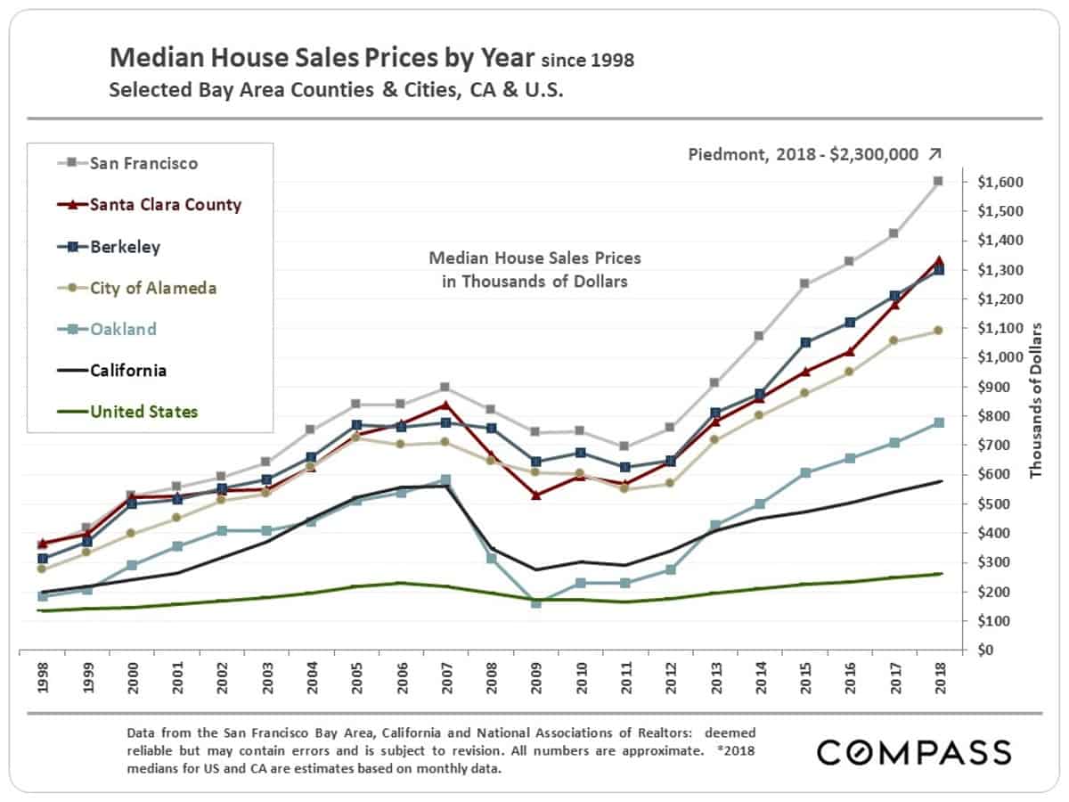
Long-Term, Annual Median Home Price Changes
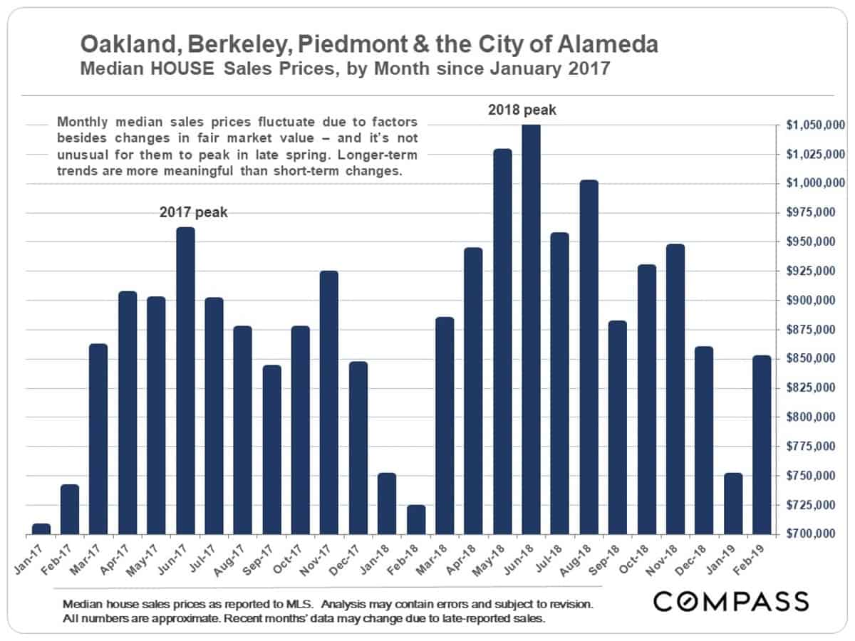
Short-Term, Monthly Median Price Changes
Median house sales prices have been holding up better here than in any other Bay Area market. In fact, the February 2019 median home sales price was significantly higher on a year-over-year basis. But February is a very low sales volume month. What is far more important is what occurs over the next 4 months.
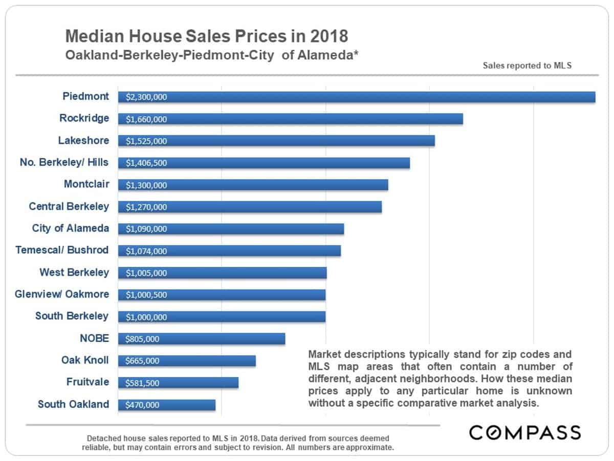
2018 Median House Sales Prices
by City or MLS District
The neighborhood labels below usually represent larger MLS areas that typically contain different neighborhoods or parts of different neighborhoods. These should be considered very approximate median prices giving a general idea of comparative values.
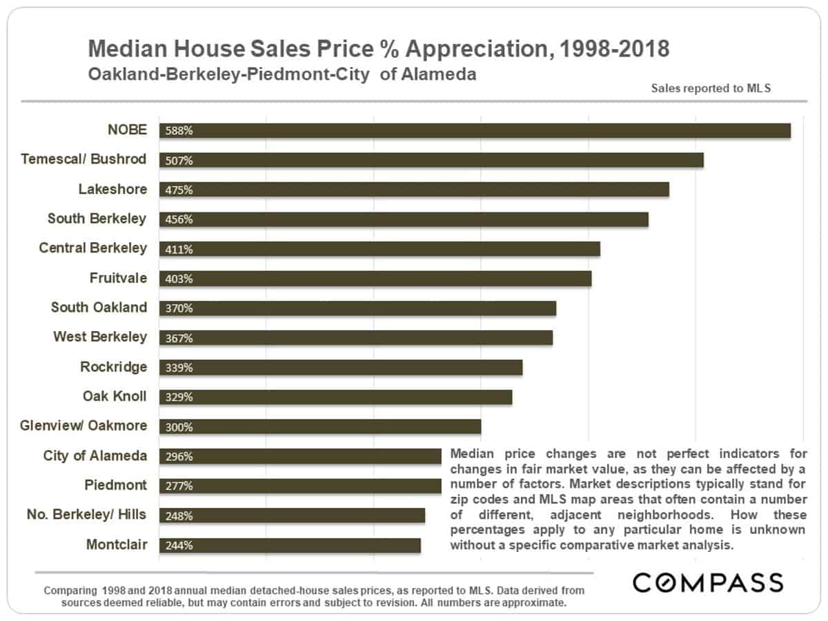
Median Home Sales Price Appreciation
by City or MLS District, 1998 – 2018
County, city and neighborhood markets appreciate due to a wide variety of local and macro-economic reasons: economic cycles, inflation, consumer confidence, interest rates, employment, gentrification, new construction, comparative affordability (to other nearby markets), population growth, buyers’ median age, commuting, fashion, and so forth. The combination of factors affecting appreciation in any particular area is often specific to that market.
Around the Bay Area, more expensive homes have generally appreciated less than more affordable homes, especially over the last 3-4 years. On the other hand, during the last downturn after 2008, the prices of more expensive homes usually declined significantly less. These appreciation percentages include some of the very highest seen in the Bay Area, but should be considered very approximate.
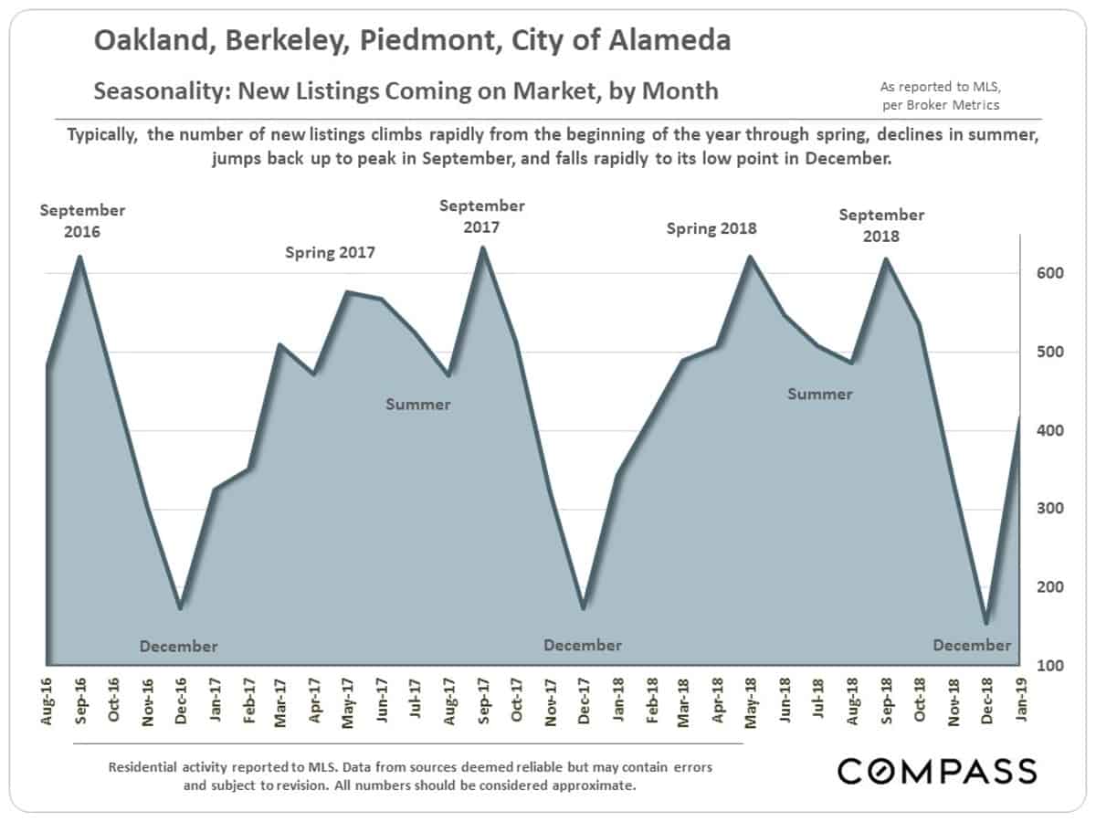
Market Seasonality
New Listings Coming on Market
by Month
New inventory usually starts pouring into the market right now, in late February and early March, to fuel what is usually the biggest selling season of the year.
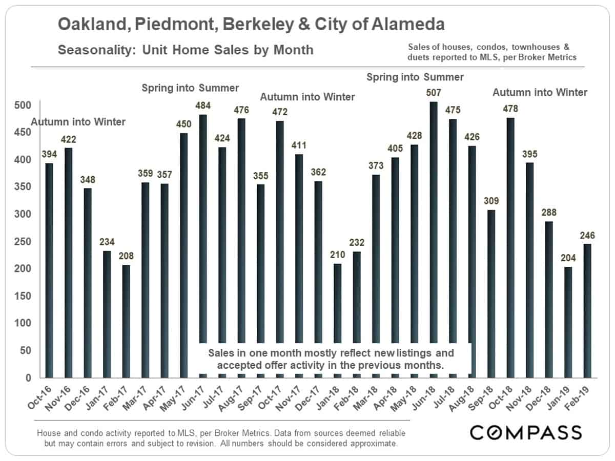
Sales Volume by Month
So far, sales volumes in the new year are holding up well as compared to the same period in 2018. But typically March is when we start to see the big jump in sales following the large increase in new listings.
Active Listings on the Market
as of March 1, 2019
The number of active listings fluctuates daily, and the numbers below are rapidly increasing as more new listings come on market. These next 2 charts are snapshots of active listings posted to MLS as of March 1st.
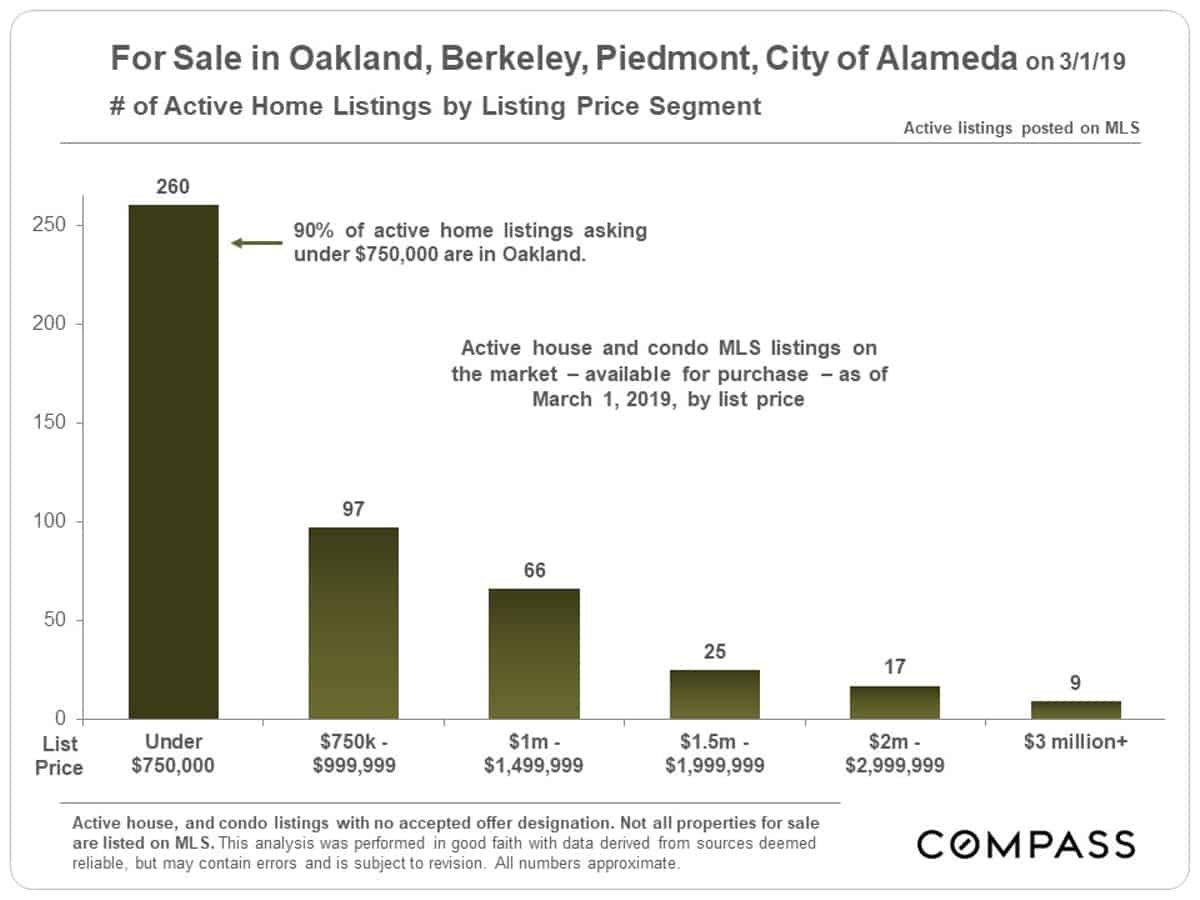
Listings on Market by Price Segment
3/1/19
One of the major factors in the strength of the Oakland-Berkeley market in recent years has been its much greater affordability – even after all the home price increases since 2012 – when compared to San Francisco.
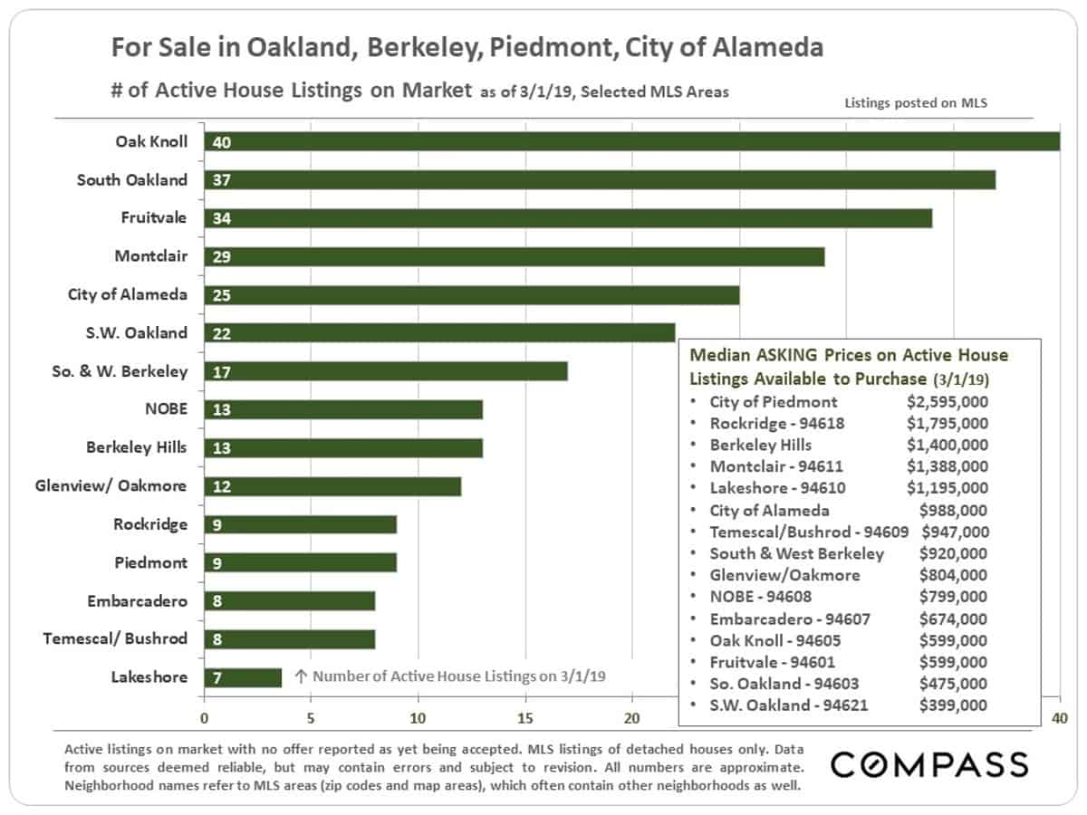
Number of Active Listings & Median LIST Prices
by City or MLS District, 3/1/19
The supply of listings available to purchase varies widely between cities, districts and neighborhoods. This can be a simple reflection of market size and/or an indicator of supply and demand dynamics. If median LIST prices (below) are well above median SALES prices (charted earlier in this report), it is typically a sign that the balance in listings for sale is disproportionately weighted towards higher priced properties, which often take longer to sell – and/or a sign of systemic overpricing beyond what buyers consider fair market value.
Market Statistics by Area
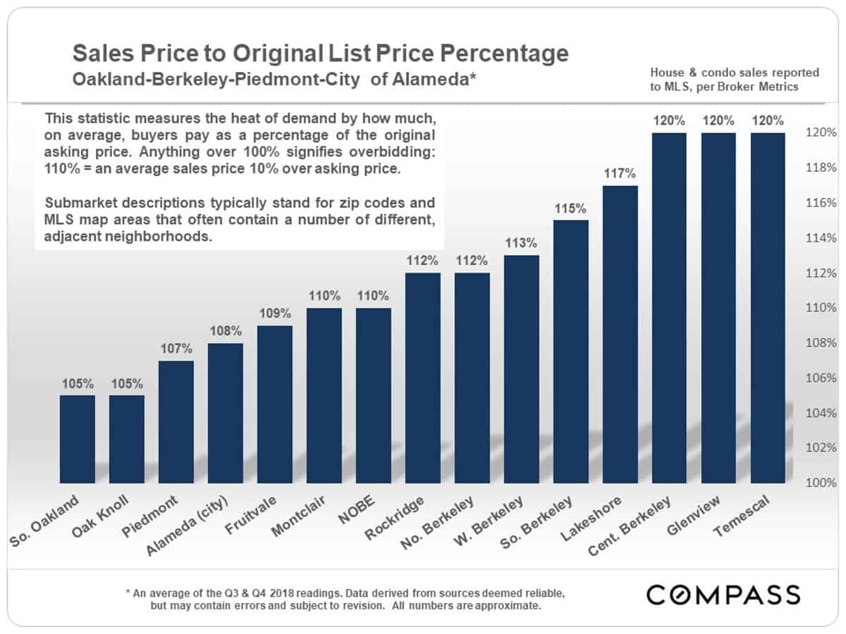
Sales Price to Original List Price %
by City or MLS District
A percentage over 100% signifies an average sales price over asking price: 110% = 10% over. Generally speaking, these are the highest overbidding percentages in the Bay Area, though they also remain high in San Francisco. In many other markets, overbidding has dramatically declined since mid-2018 as inventory has increased while demand has declined.
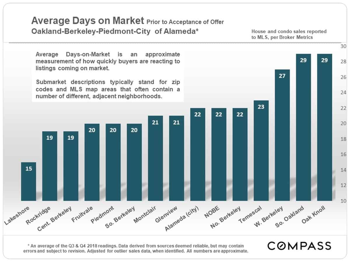
Average Days on Market
by City or MLS District
All of these readings would be considered low, and many are extremely low compared to norms in the state and U.S..
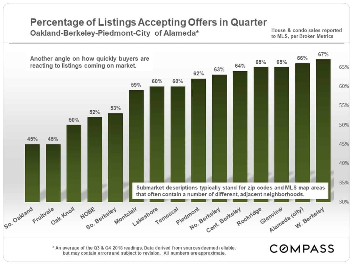
Percentage of Listings Going into Contract
in Quarter, by City or MLS District
All of these percentages would be considered high and many are extremely high by market norms in the Bay Area, state and country.
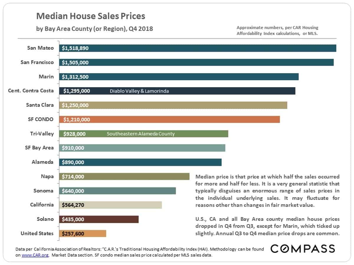
Comparing Bay Area Counties
Median Home Prices, Q4 2018
As compared to the Q4 median house sales prices illustrated below, Oakland’s was $780,000, the city of Alameda’s was $1,078,000, Berkeley’s was $1,278,000, and Piedmont’s was $2,250,000.
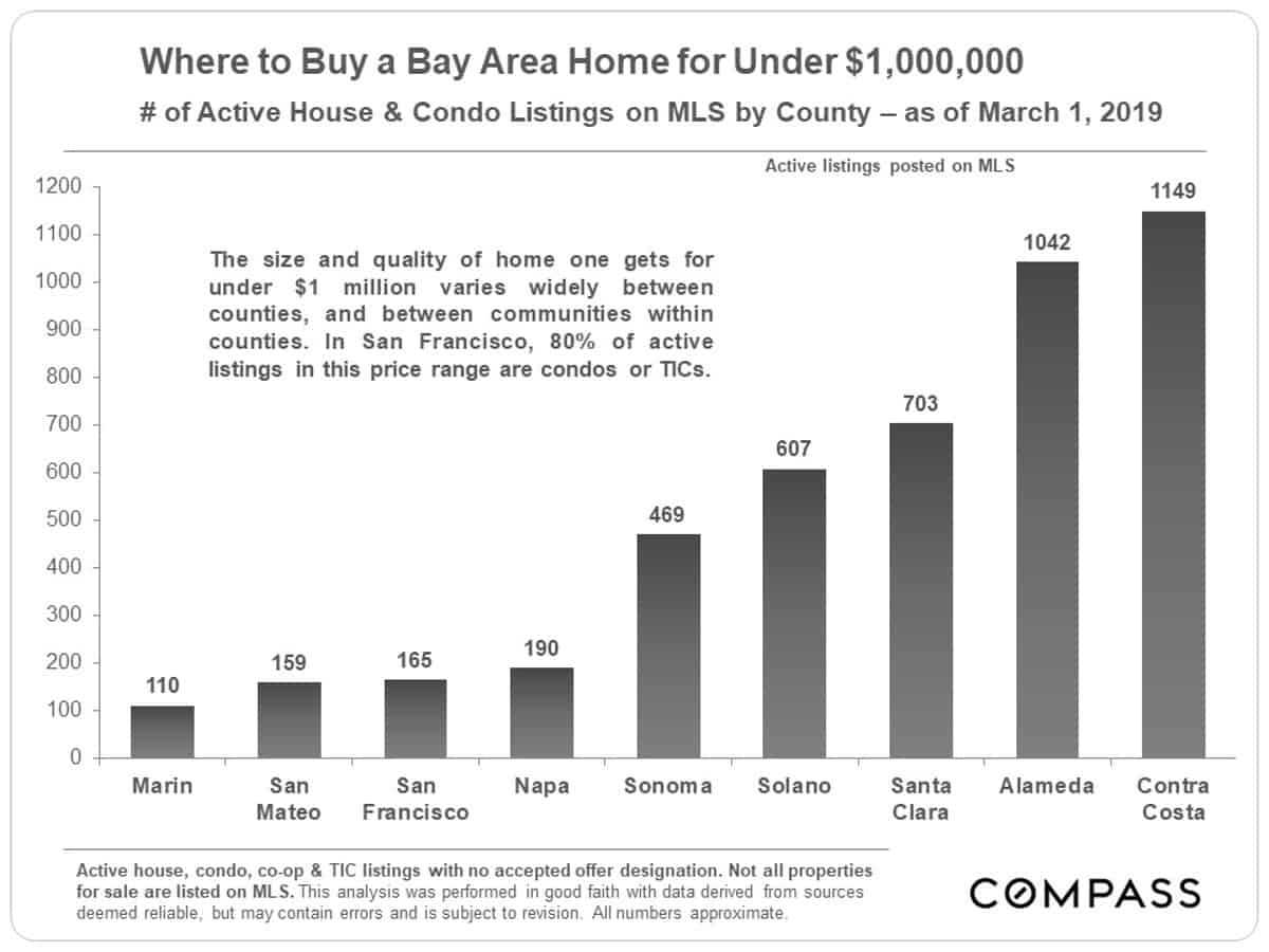
Number of Home Listings under $1 Million
by County, 3/1/19
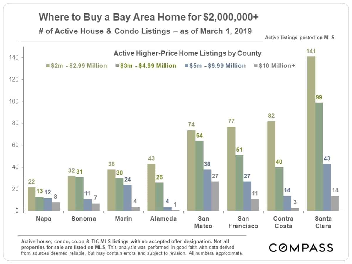
Number of Home Listings Asking $2 Million+
by County, 3/1/19
Alameda County does not have a particularly large percentage of its listings priced at $2 million and above, though, of course, it has a number of expensive neighborhoods in the Oakland-Berkeley region. Piedmont is the most expensive city in the East Bay, as measured by median home sales price.
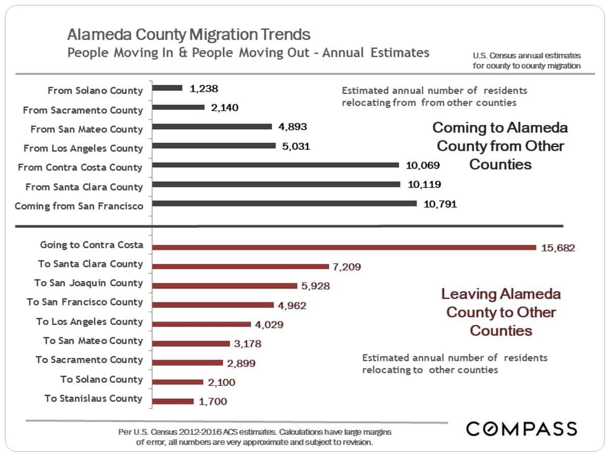
County to County Migration
People Moving to or Leaving Alameda County
People move to the Bay Area from all over, and people leave its counties to move to a vast number of locations, for differing reasons. This analysis looks at those counties with the greatest number of people moving to and from Alameda County. In many cases, there is a large exchange between 2 counties, with residents going in both directions. Often, but not always, the outward flow is greater to counties with more affordable home prices, but there are many factors – such as schools, employment, commute and other quality of life issues – at play.
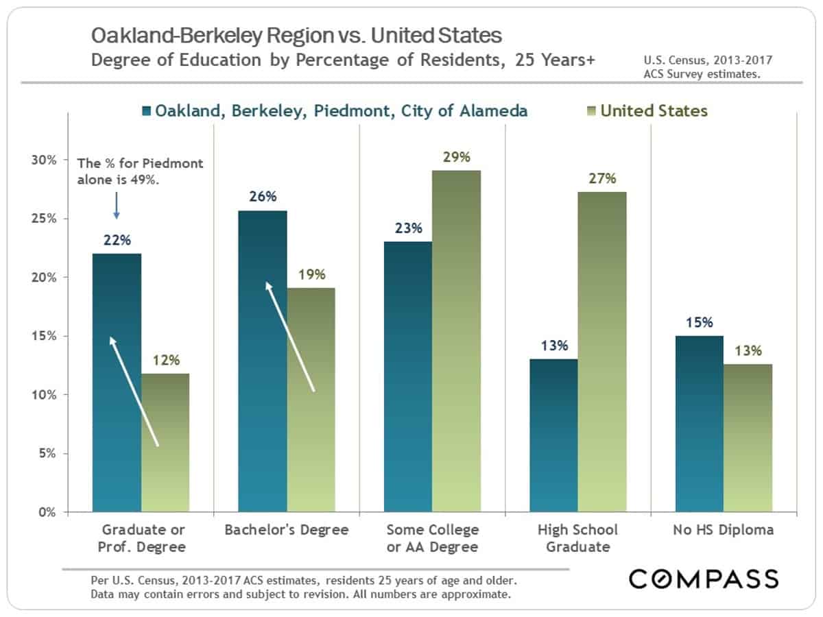
Demographics Snapshot
Educational Attainment
Oakland-Berkeley Region vs. U.S.
The area is very highly educated as compared to national norms. Piedmont and Berkeley, in particular, have populations that are extremely well educated.
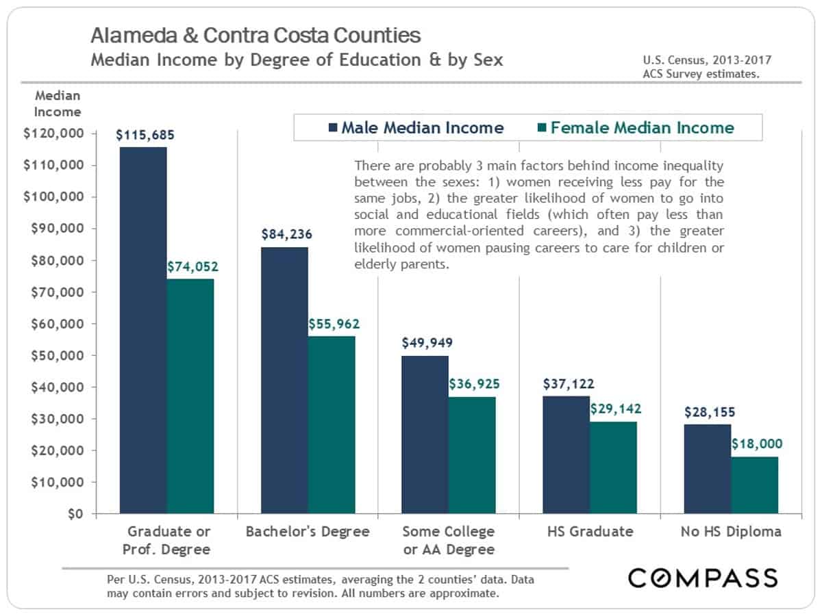
Education & Income
Disparities between the Sexes
An indicator of the income-generating value of education, along with an unhappy indicator of where progress remains to be made in income equality. (As an aside, real estate is certainly one of the first professions that saw income equality established between the sexes: Women have been holding their own and, indeed, often dominated rankings of top Bay Area agents for many decades.)
The statistics in this report are very general and approximate indicators based upon listing and sales data pertaining to assortments, of varying size, of relatively unique homes across a broad spectrum of locations and qualities. How these statistics apply to the current value, appreciation trend, and prevailing market conditions of any particular property is unknown without a specific comparative market analysis.